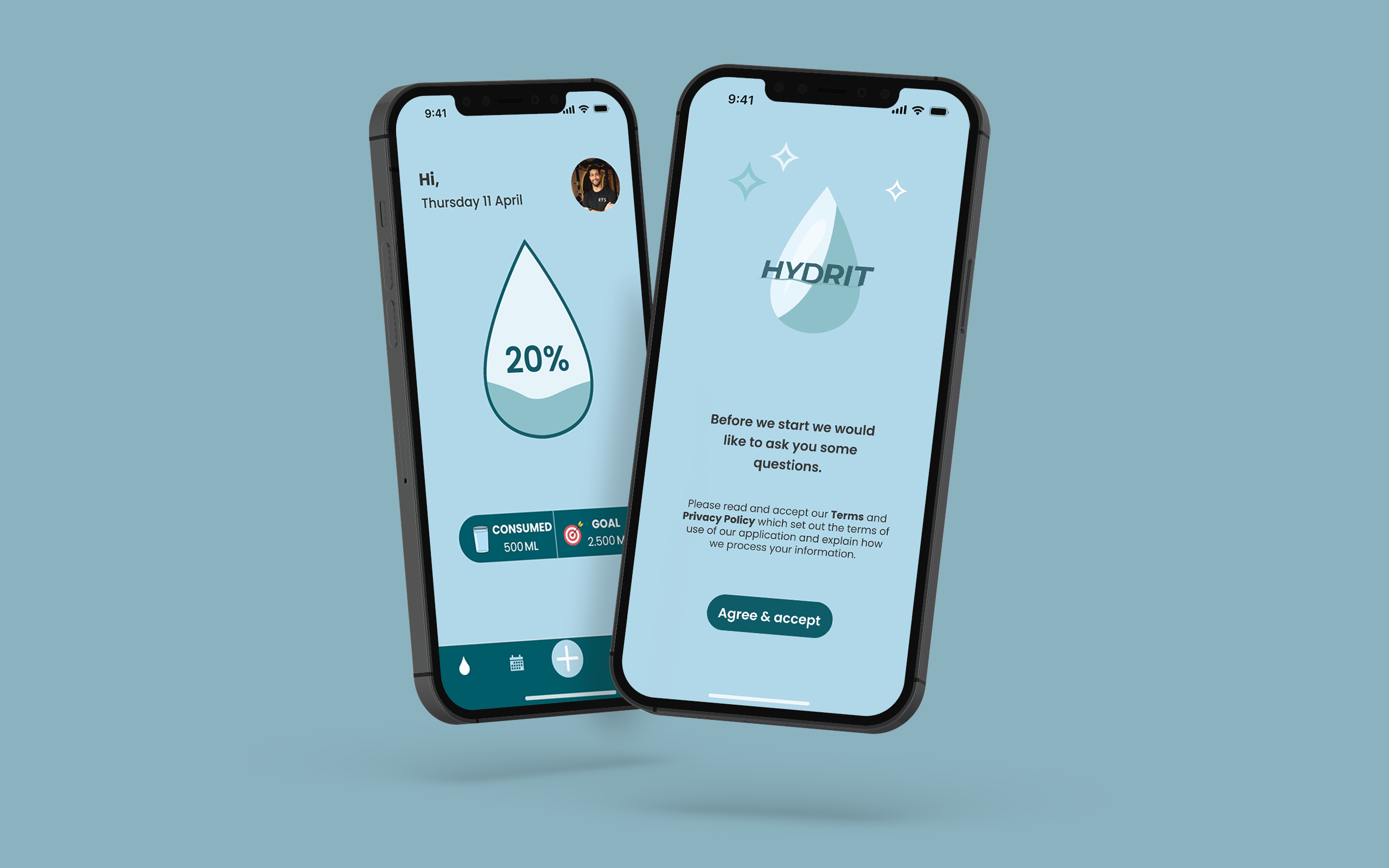
Hydrit, your water intake reminder
Role
My role in this project was to fulfill both roles as UX and UI Designer.
Team
UX/UI Designer: Lidian Bregman
Duration
5 weeks / 50 hours
(30 March 2024 – 5 May 2024)
Tools
Figma, Google docs, Google forms, Illustrator, Photoshop, Zoom and Slack
Overview
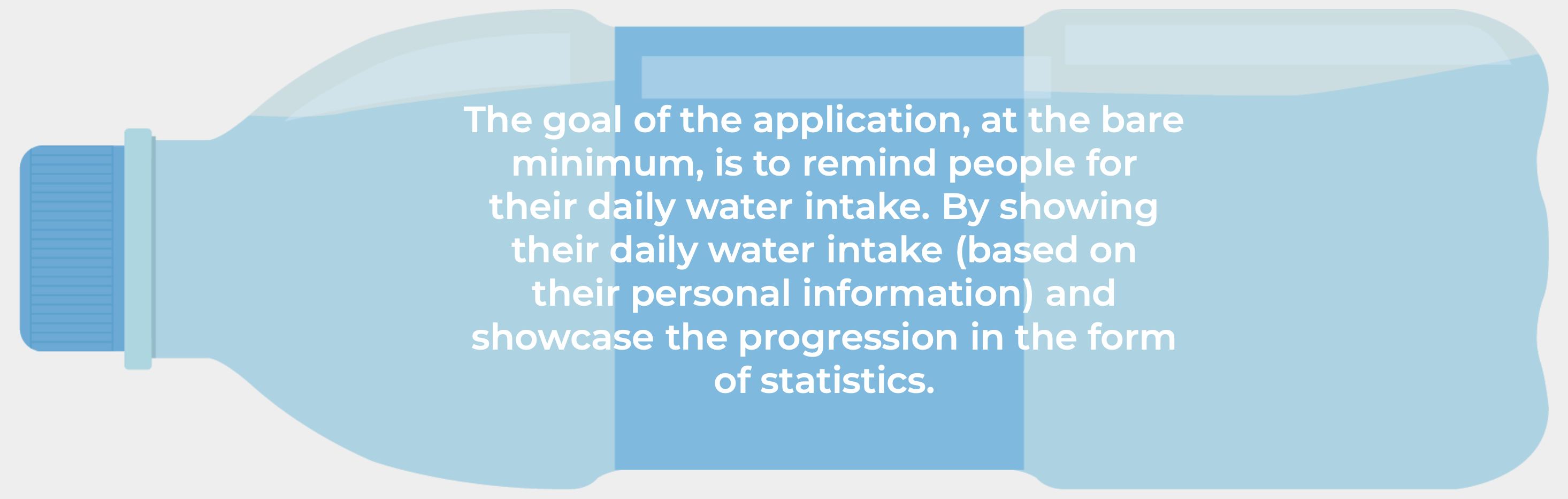
I was tasked to develop a mobile application (iOS) for the Daily Health Conference that helps people to adopt and commit to a health improving routine so it can add more value for their members.
Scope
Competitive analysis, Information architecture, wireframing, error states, dashboard design, rapid prototyping, user testing and strategy.
// Quantitative & qualitative research
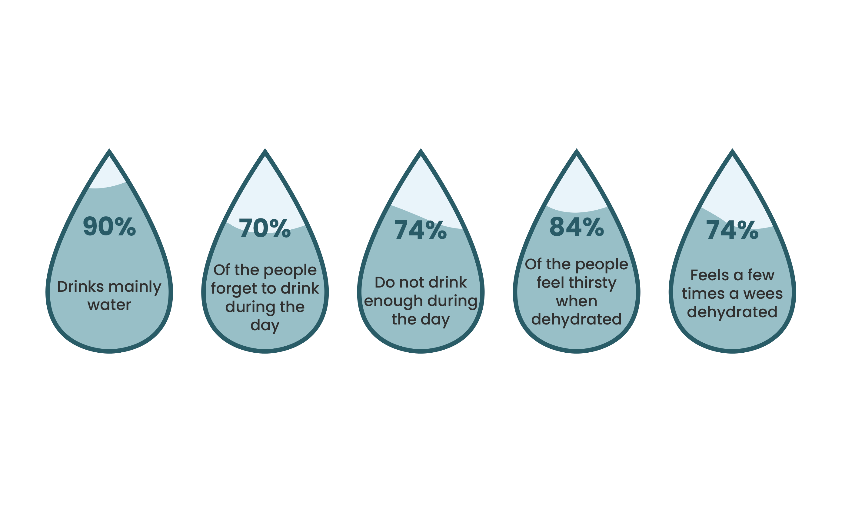
The project started with secondary research (quantitative data) that was found online and in books. Whereafter I continued with quantitative research by conducting surveys with 65 people. For the qualitative research I interviewed five people that are facing problems with their daily water intake in order to understand the pain points regarding their water intake. Some insight from the research are:

// User persona & user journey
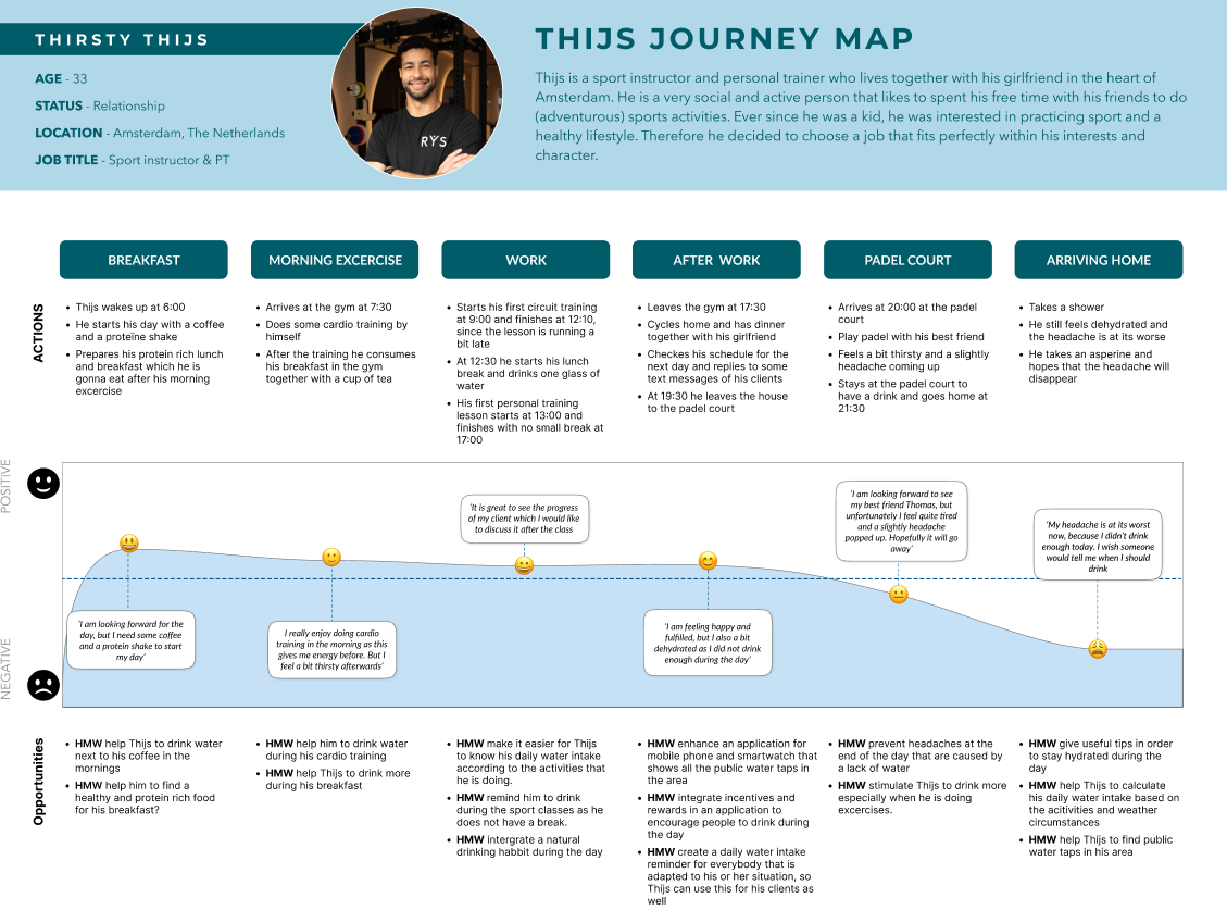
To create a clear overview of our user persona I used data that was collected through the user persona research. The main character ‘Thirsty Thijs’ is based on this information and stated in a clear overview. After creating the user persona I mapped out a user journey of one day of Thijs to present his experiences throughout the day.

// Problem statement
With the help of the user journey I knew the pain points of our user, so it was time to ideate the problem with the help of the problem statement. This really helped me to focus on the problem, why is it important and who does it impacts.

// MoSCoW method & minimum viable product
The next step was to state all features of the application with the help of the MoSCoW method. This tool helped me to brainstorm possible ideas and to prioritize all features for the application, while keeping the required features of the client in mind. After all the features of the application were clear I started to create the minimum viable product (MVP).

// Information Architecture
I started to plan the information architecture by creating the user flow. This tool helped me to understand how the user will navigate through the application while referencing my ideas and taking into account all required features that would be available during all different phases of the application.

// Concept sketches & low fidelity wireframes
After the user flow was created I continued with the concept sketches and started with the low-fidelity wireframes, which included all necessary pages for the application at its bare minimum. Eventually I tested the low fidelity wireframes with in total three people.
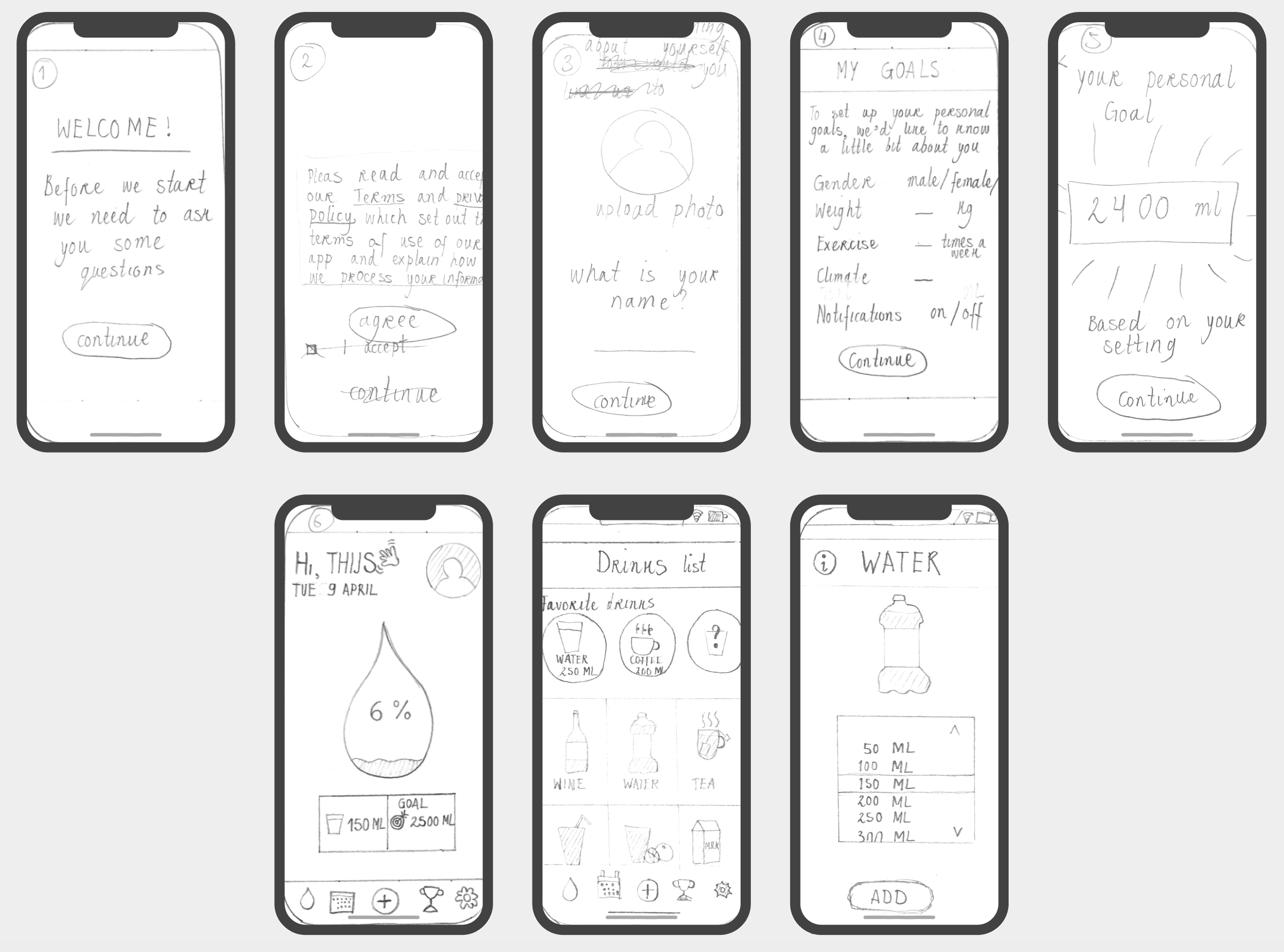
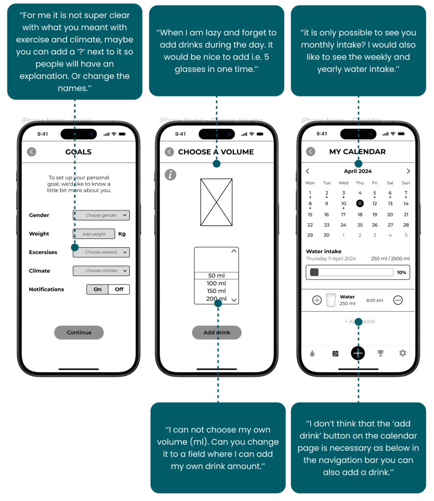
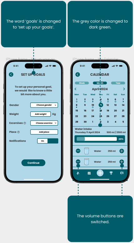
// Low fidelity wireframes testing
BEFORE TESTING
After testing

// Mid fidelity wireframes
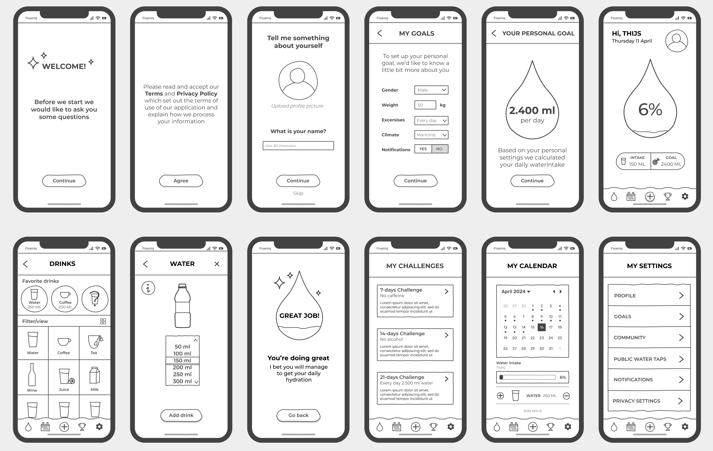
With the test results from the low fidelity wireframes I implemented all feedback into mid fidelity wireframes. While I was creating the new wireframes, I also started working on the components which helped me to think about the different states of the buttons, bars, text, and eventually helped me to save time for the high fidelity wireframes.
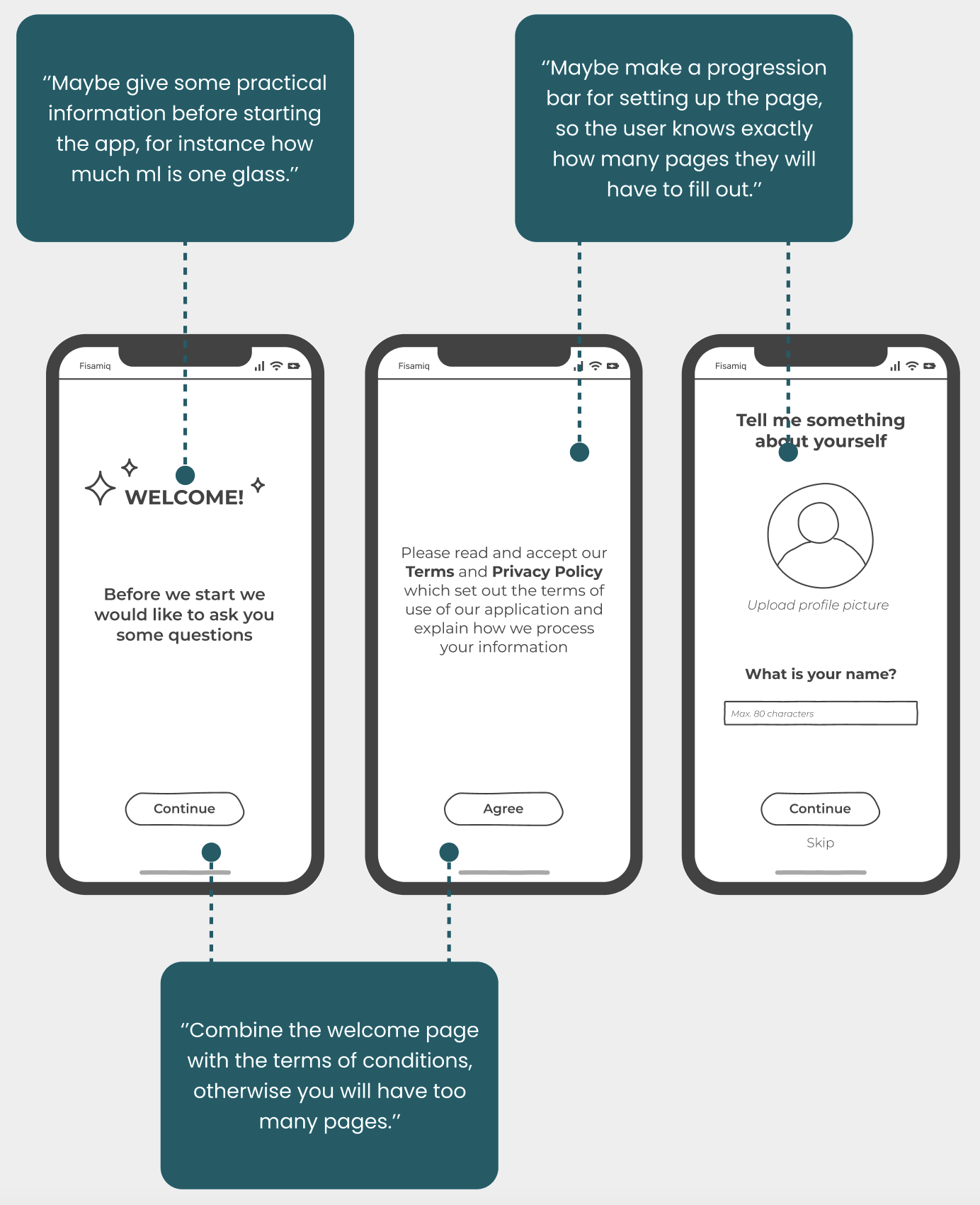
// Mid fidelity wireframes testing
Before testing
After testing

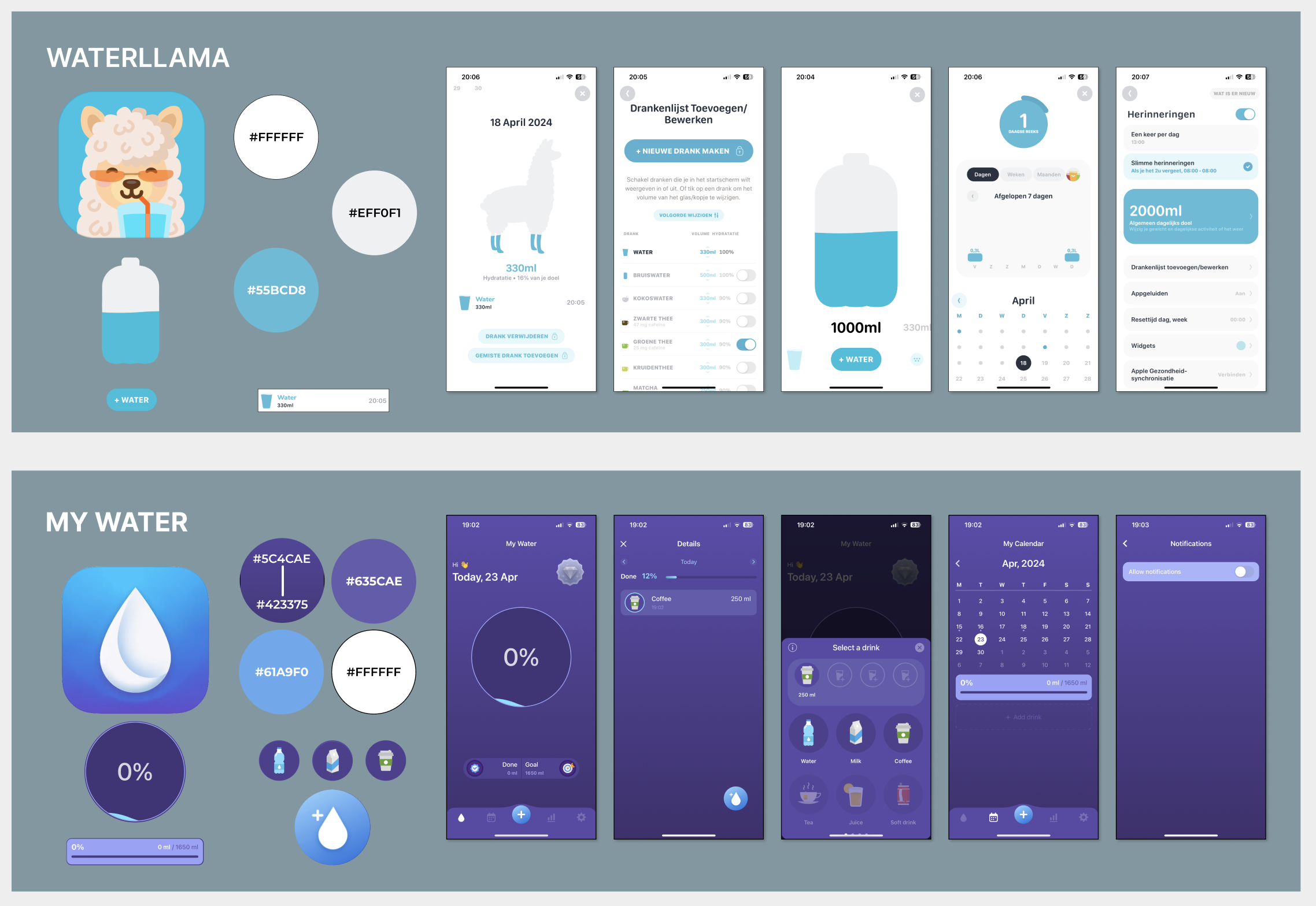
// Visual competative analysis
The visual competative analysis helped me to get insight into the color palette, typography, iconography, visual language of the competitors in order to understand why they made specific choices for their design and to see if there is a gap for improvement. The two competitors that I chose were Waterllama and My Water.
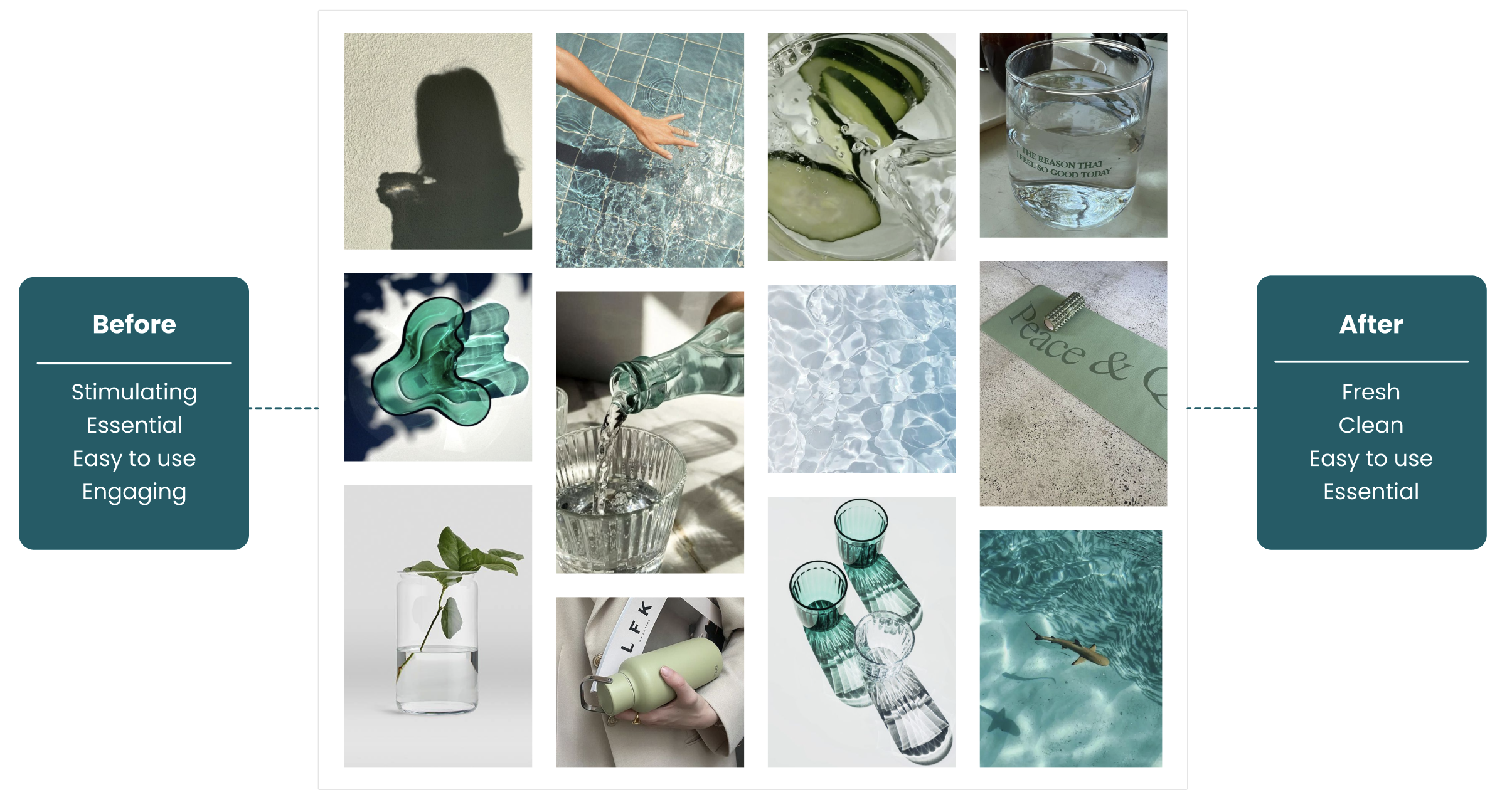
// Brand Attributes & Moodboard
Now it was time to start with the brand attributes. The chosen brand attributes were: stimulating, essential, easy to use and engaging. With these brand attributes I collected images that matches with these words and created a moodboard to convey a certain feeling at a glance. With the help of the Microsoft Desirability Toolkit I tested the moodboard with ten people which gave me the final brand attributes: fresh, clean, easy to use and essential.
// Color Palette & Typography
After the moodboard and brand attributes it time to start with the colors palette and typography. The colors are based on the blue, turquoise and green colors that are picked from the moodboard and also matches with the brand attributes. For the typography I chose the font: Poppins. Mainly because it is a contemporary and versatile typography which is suitable for various design applications. In addition, this font is modern with a clean and sleek look with a perfect balanced ration with round shapes and sharp lines, which makes it easy to read on different screens sizes.

// Style Tile
With the chosen colors and typography I started to create a style tile of all visual components of the application. The style tile shows all the various UI elements that the user interacts with and contains all elements, such as: colours, typography, bars, iconography, shapes and more.

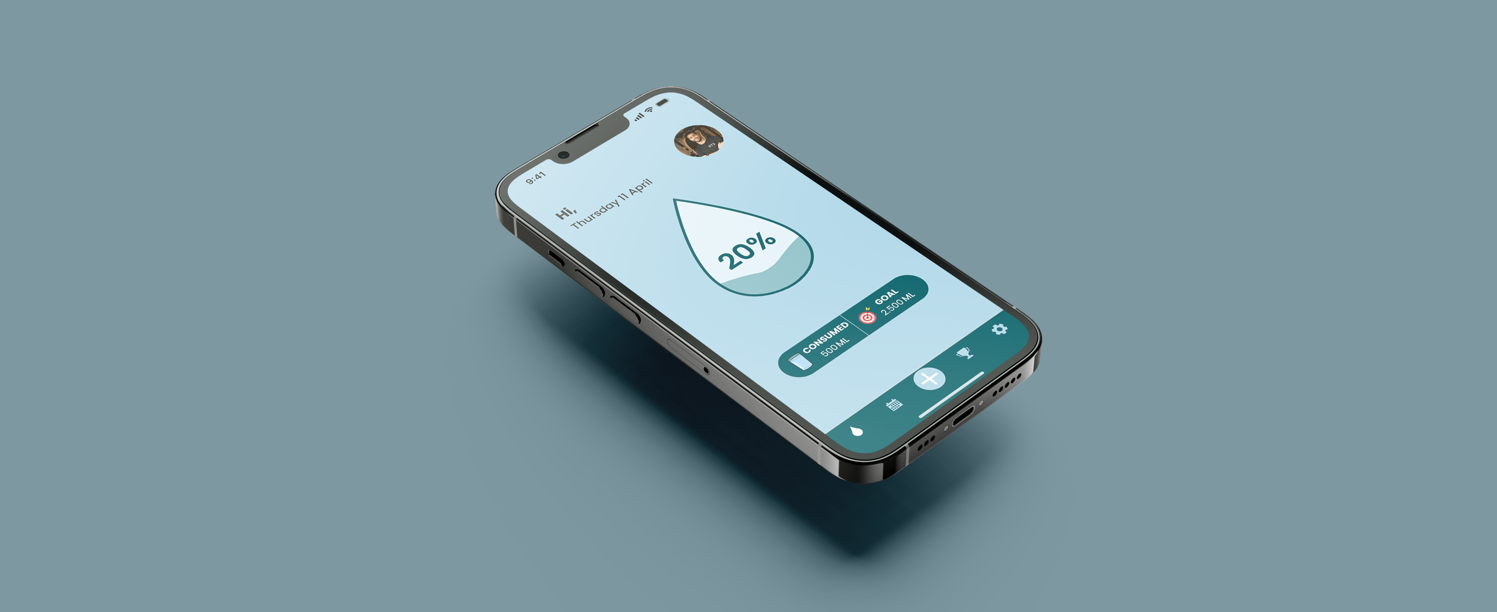
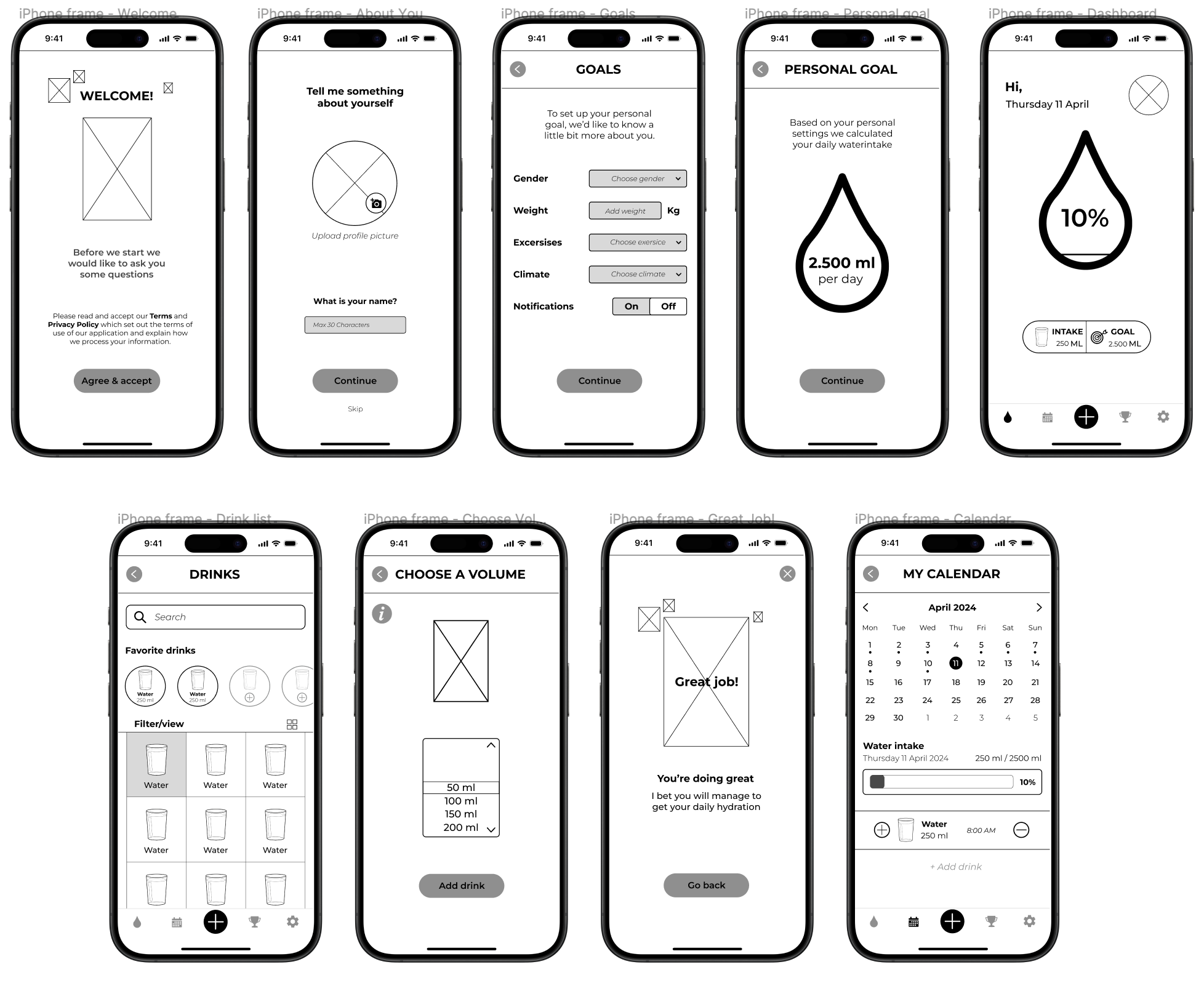
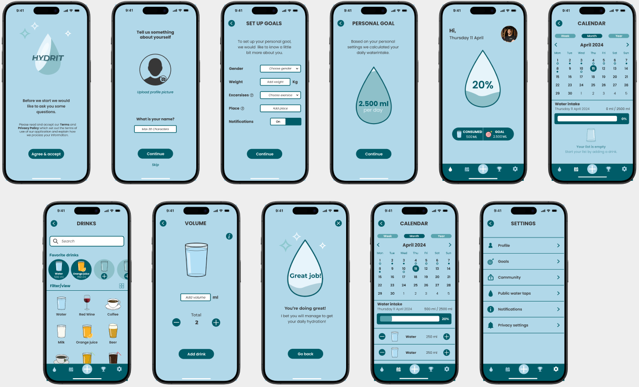
// High Fidelity & Usability Testing
With completing the style tile and the results of the mid fidelity testing, I created the high fidelity prototype which I tested with three people and implemented the feedback into new wireframes which I tested with again three people in the form of a usability testing.
// Desirability testing
Before testing
After testing


// Retrospective
Solo project
This challenging project taught me to work with a strict timeline, prioritize features and empatize with users. As this was a solo project I noticed that it was easy to make decisions by myself and therefore I could really stick to my own schedule. Besides this project gave me the opportunity to practice my prototyping and presentation skills.
Decision making
As I decided to do this project solo I had nobody to rely on. Therefore I learned a lot about making decisions by myself and really had the chance to dive deep in both UX as UI Design.
