Matt Madden, a UK based food photographer
Role
My role within the project was to fulfill both roles as UX/UI Designer.
Team
UX/UI Designer 1: Lidian Bregman
UX/UI Designer 2: Olga Escribano
Duration
5 weeks / 50 hours
(3 February 2024 – 9 March 2024)
Tools
Figma, Google docs, Google forms, Illustrator, Photoshop, Zoom and Slack (remote)
Overview
This project was about improving and creating a responsive website for food photographer Matt Madden in order to get him more clients. For this reason the project is created for desktop, but also usable for tablet and mobile phone.
Scope
UI/UX, stakeholder interview, information architecture, responsive design, wireframing, rapid prototyping, user testing and strategy.
// Research current website
This project started with the researching of the current website of our stakeholder: Matt Madden. In order to see how his current website looks like, which pages are on the website and the visual aspects.

// Stakeholder interview
As we wanted to get more insights into the pain points of our stakeholder, we planned an interview with him. My role within this interview was to lead the interview by asking the questions to our stakeholder and try to get really into depth with him.
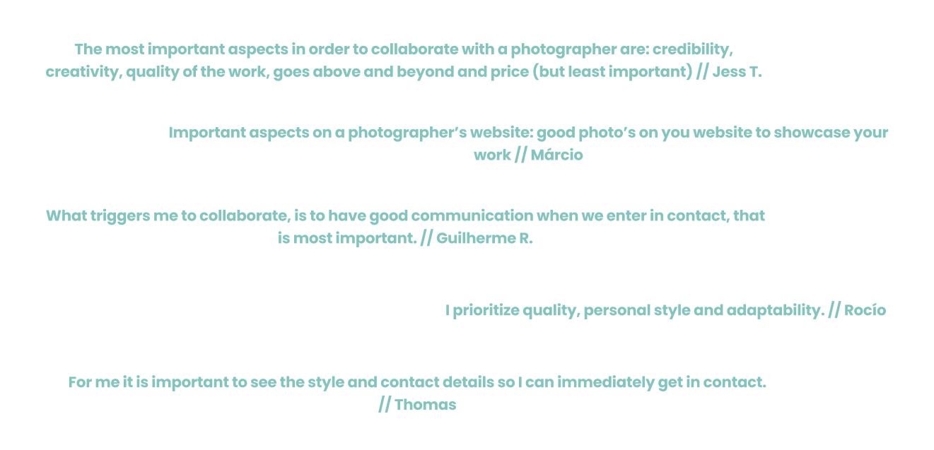
// Qualitative research
After the stakeholder interview we started with qualitative research with the help of user interviews. In total we interviewed five people that gave us both user matter and subject matter insights in order to understand the difficulties that they are facing. We equally divided the tasks as interviewer and the notetaker.
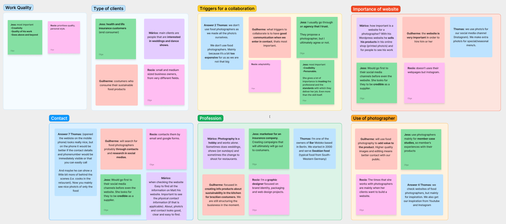
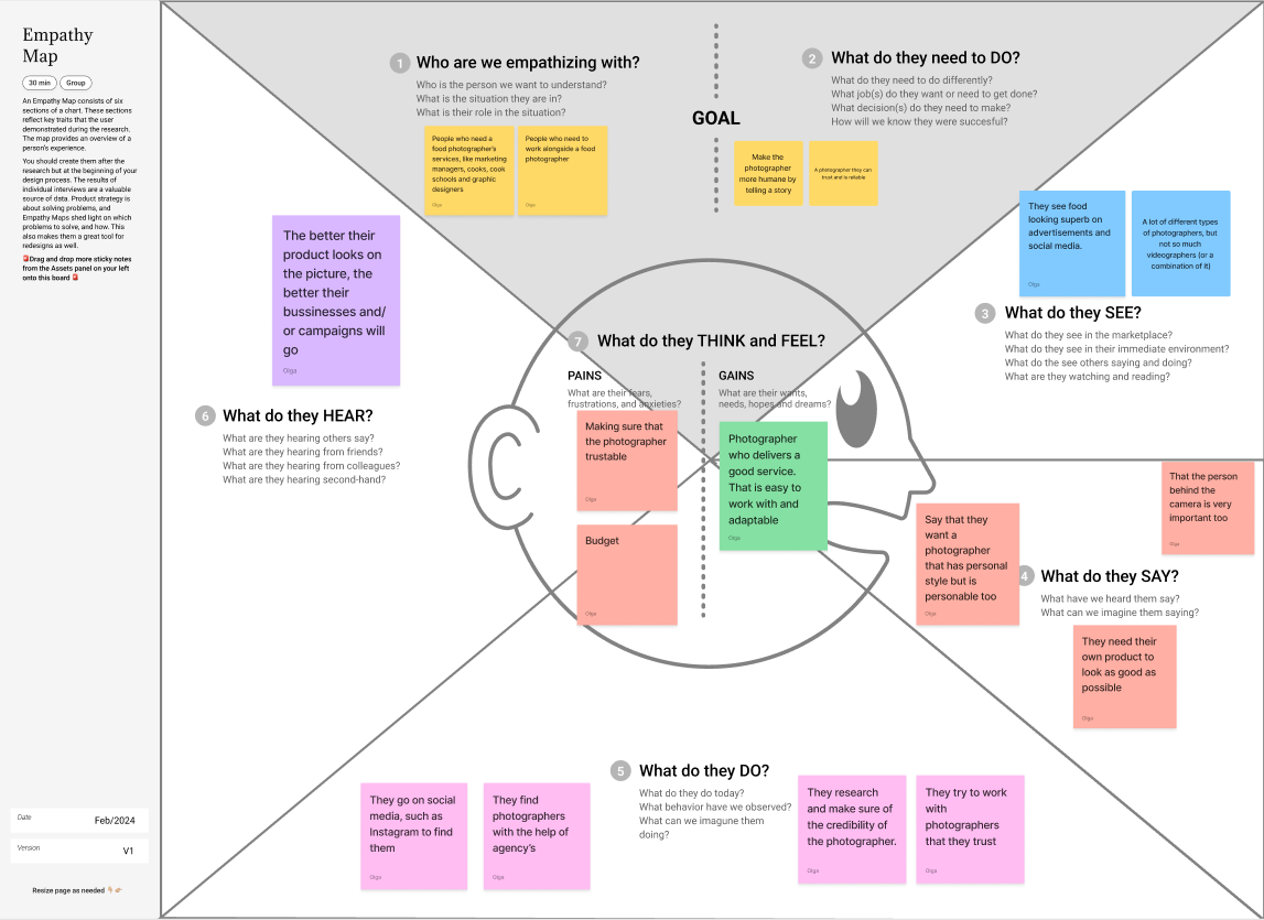
// Affinity diagram & empathy map
With all the collected data from the research and interviews, we clustered all similar topics with the help of the affinity diagram. This gave us insights into the main findings from our project. After the affinity diagram we used the empathy map which helped us to create a shared understanding of the needs from the user.
// User persona & user journey
To create an overview of our user persona we used data that was collected through the user persona research. The main character ‘Chef Charlie’ is based on this information and stated in a clear overview. After creating the user persona we mapped out a user journey of one day of Charlie to present his experiences throughout the day.


// Problem statement
With the help of the user journey we knew the pain points of our user, so it was time to ideate the problem with the help of the problem statement. This helped us to really focus on the problem, why it is important and who it impacts.

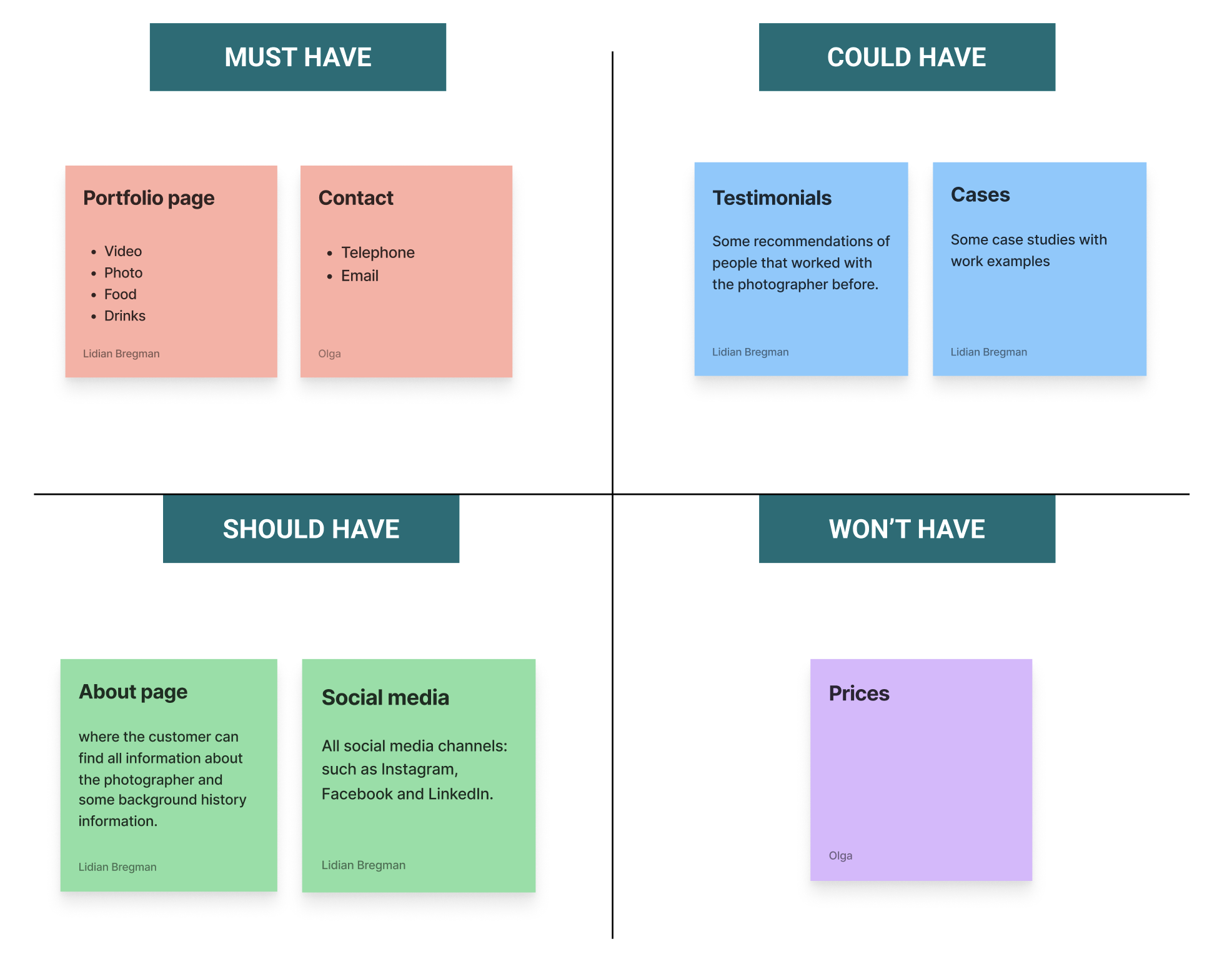
// MoSCoW method & minimum viable product
The next step was to state all features of the application with the help of the the MoSCoW-method. This tool helped us to brainstorm all the possible ideas and to prioritize all features of the website, while keeping all necessary features of our stakeholder in mind. After all the features were clear we started to formulate the minimum viable product (MVP).

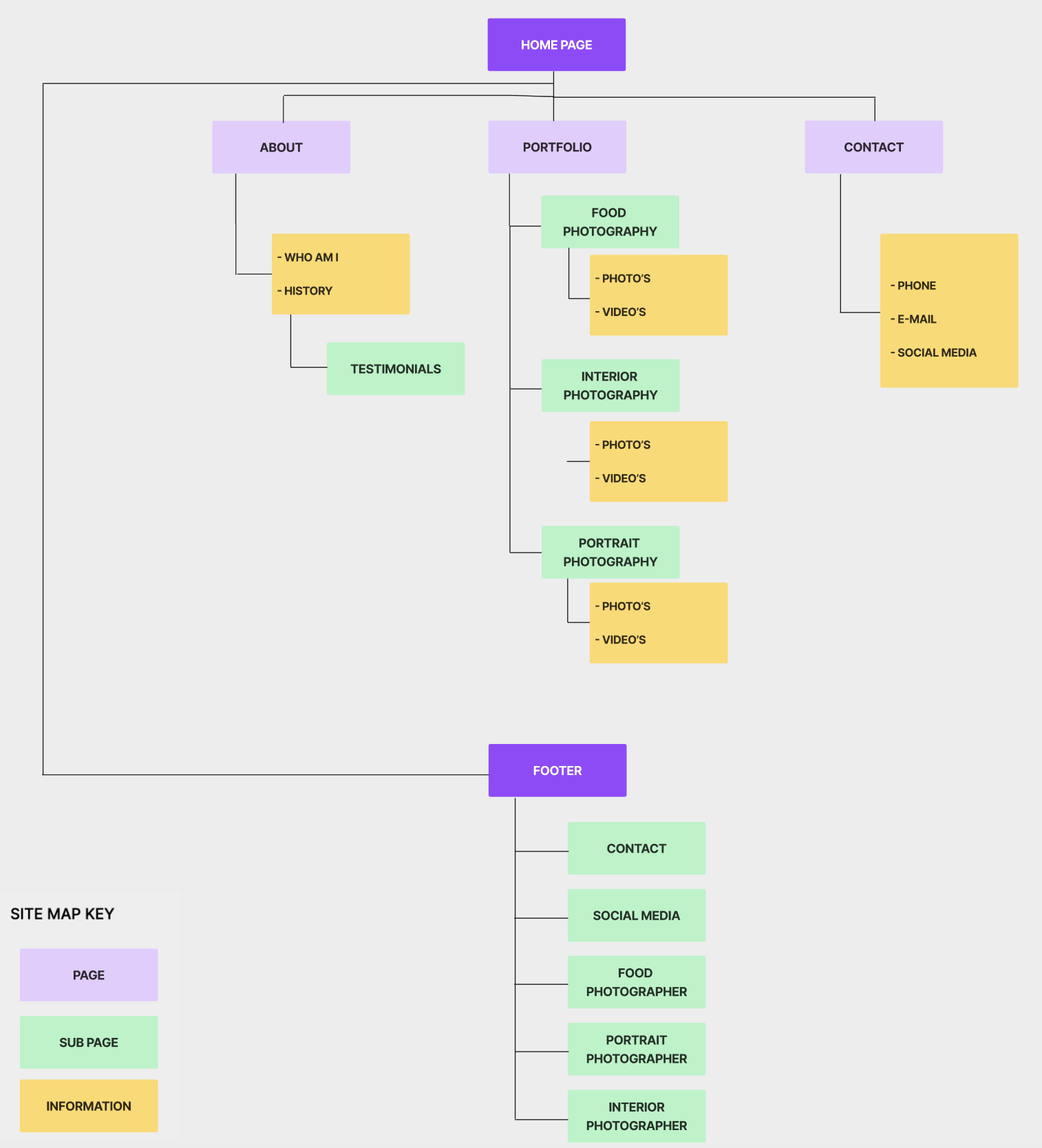
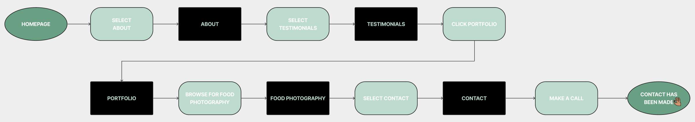
// Information Architecture
We continued with the information architecture, by starting with the site map. Both of us made one site map and afterwards we compared the two site maps and chose the best one to continue with. With the chosen site map we continued to sketch out the user flow. This tool helped us to understand how the user will navigate through the application while referencing all ideas and taking into account all required features that would be available during all phases of the application.
// Concept sketches & low fidelity wireframes
Now the information architecture was clear, we started with the concept sketches and develop these sketches into low fidelity wireframes in order to validate our ideas. My task was to make all sketches digital and to make a prototype with the help of Figma. Which we eventually tested with three people.


// Low fidelity wireframes testing
Before testing
After testing


// Mid fidelity wireframes
With the test results from the low fidelity wireframes we implemented all the feedback into the mid fidelity wireframes. While we were creating the new wireframes, we also started working on the components which helped us to think about the different states of the buttons, bars, text, and eventually helped me to save time for the high fidelity wireframes.

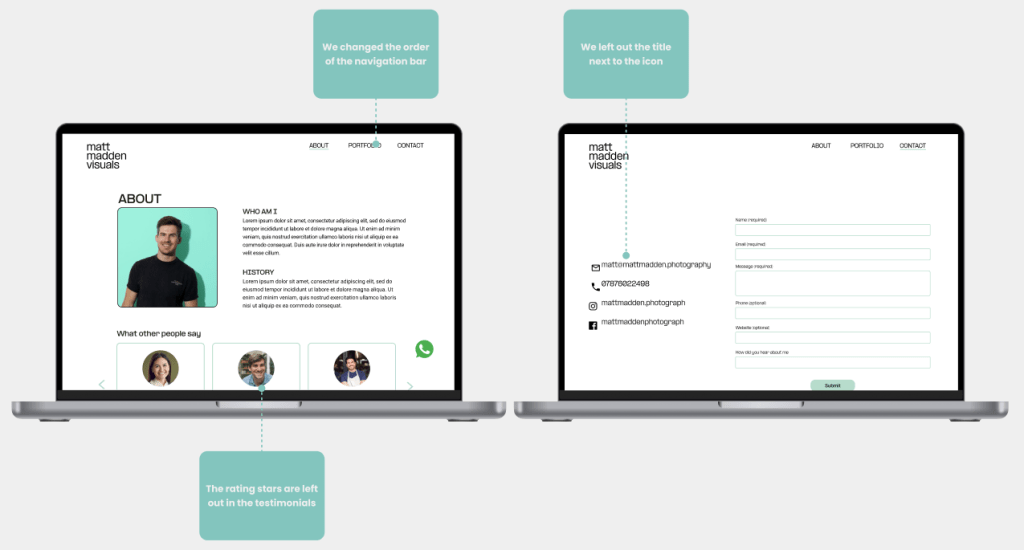
// Mid fidelity wireframes testing
Before testing
After testing

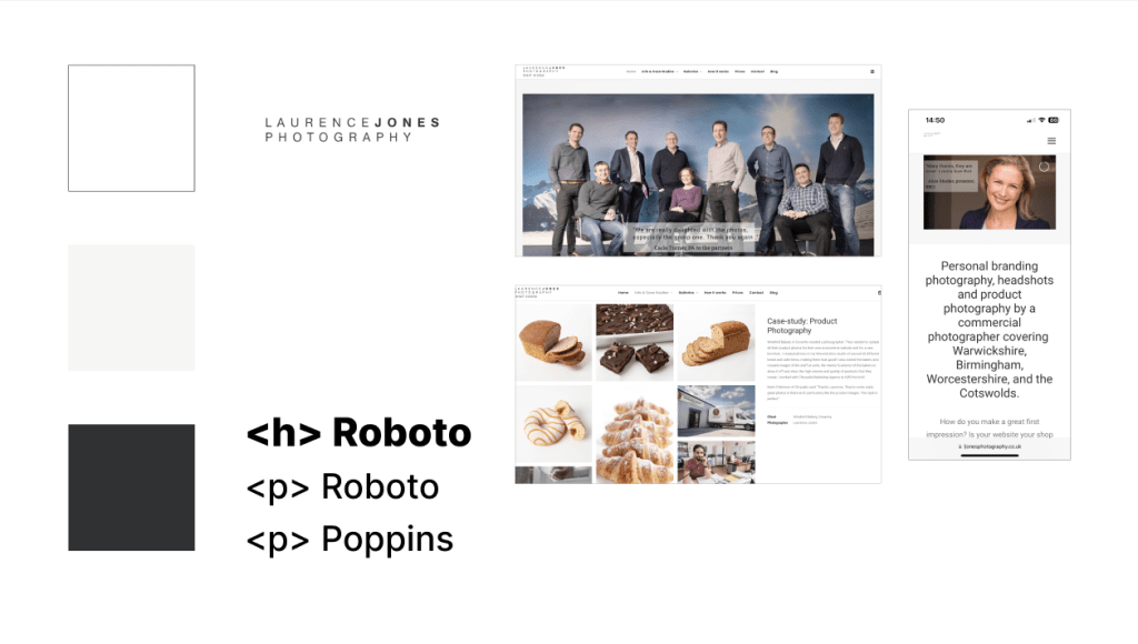
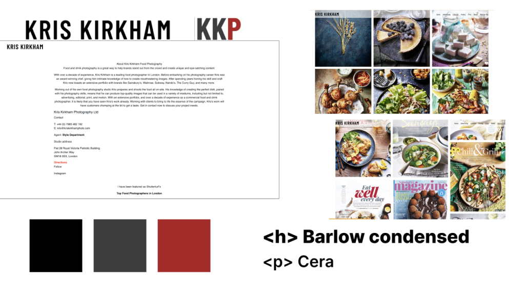
// Visual competitive analysis
The visual competitive analysis helped us to get insights into the color palette, typography, iconography and visual language of our main the competitors. We decided to go for the three biggest competitors which are: Jack Spicer Adams, Laurence Jones and Kris Kirkham. Mainly because they are most similar Matt Madden. What we noticed was that the chosen colors, typography and logo were all quite clean and similar.

// Brand Attributes & Moodboard
Next step was to create a moodboard according to the chosen brand attributes. The chosen brand attributes were: meaningfull, clean, professional, distinctive and smart. With these brand attributes we collected images that would matches with these words and created a moodboard to convey a certain feeling at a glance. For the moodboard we both collected images whereafter we compared the two moodboards and created the final one.

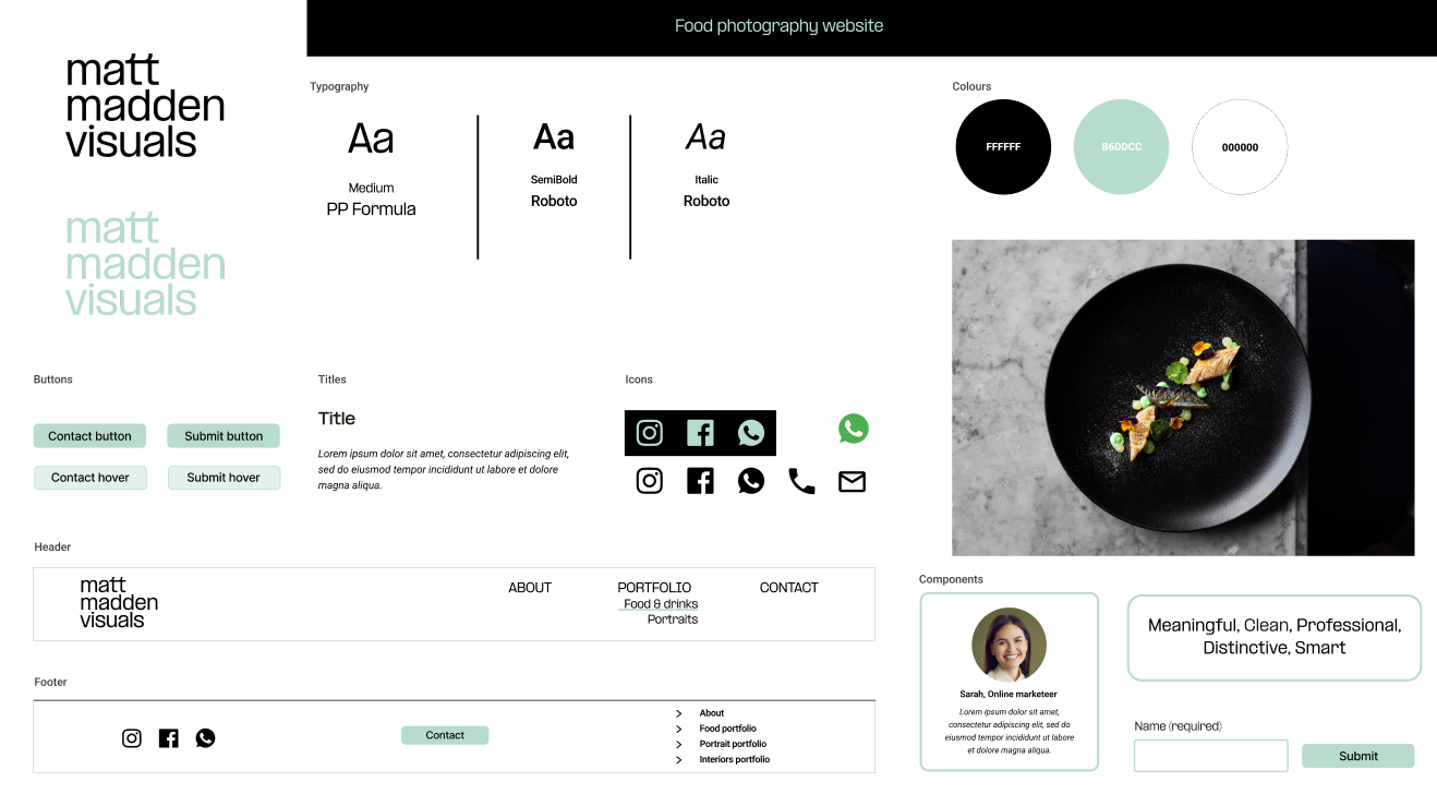
// Color Palette & Typography
Now it was time to start with the colors and typography. The chosen colors are based on the blue, turquoise and green colors that are picked from the moodboard which also matches with the brand attributes. For the typography we chose two fonts: PP Formula, this is the same font as the logo which we used for headers and Roboto which we mainly used for the text. This font is modern and in perfect balance with the font used for the titles.

// Style tile
With the chosen colors and typology we started to create the style tile with all visual components of the website. The style tile shows all the various UI elements that the user interacts with and contains all elements, such as: colours, typography, bars, iconography, shapes and more. Since the components were already created during the mid-fidelity wireframes I only had to add the right colors and typography.
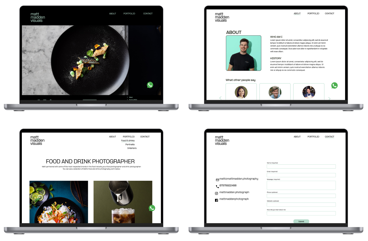
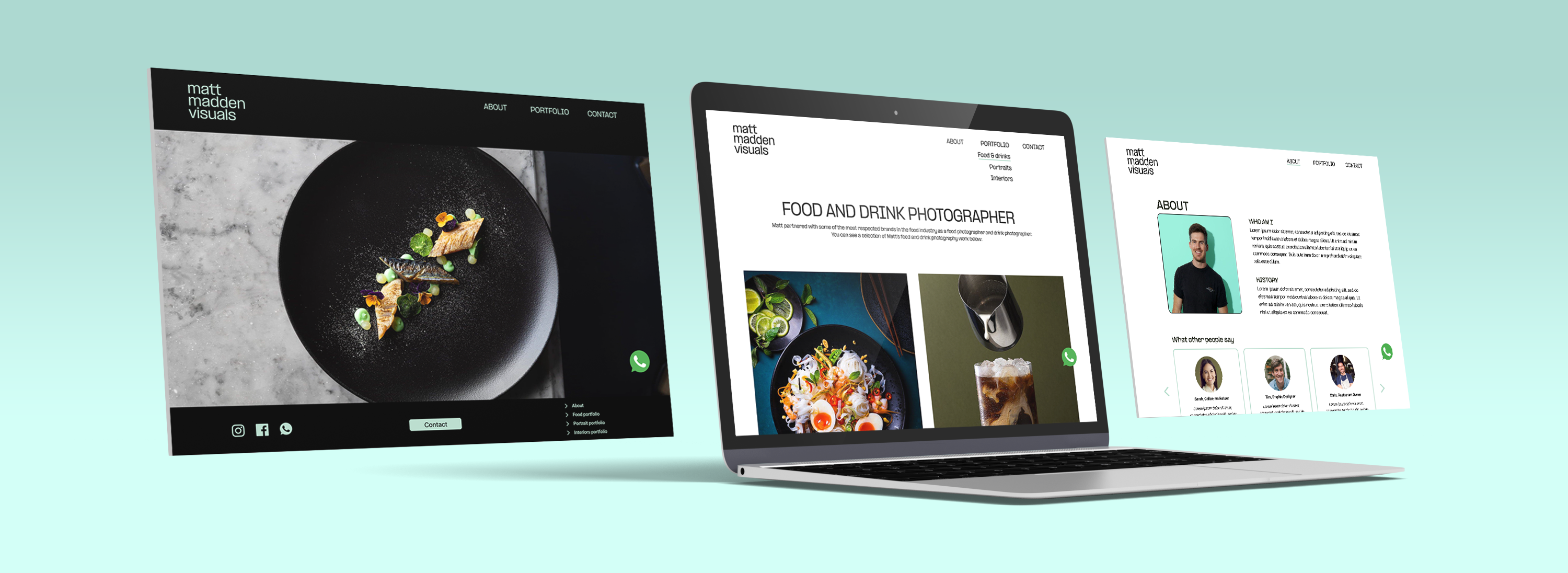
// High fidelity wireframes
After completing the style tile and test results of the mid fidelity testing, we placed together all the elements into high fidelity wireframes. Since one of the requirements of this project was that all frames had to be responsive, we made sure that all frames were compatible for desktop, tablets and mobile phones. Eventually we tested the new prototype with three people.
// Retrospective
Stakeholder interview
This was the first project where I had the chance to work for a real client. For this reason it was super exciting and great to create a product that is really needed. I also learned a lot about collaborating with a client and really listen to the needs of the stakeholder.
Responsive design
One of the requirements of this project was to create a responsive design for desktop, tablet and mobile phone. Therefore, I had the chance to learn a lot about how to implement this in figma.
 // Lidian Bregman