Vaca Magra, a live performance association from Portugal
Role
My role within the project was to fulfill both roles as UX/UI Designer.
Team
UX/UI Designer 1: Lidian Bregman
UX/UI Designer 2: Diana Guerra
Duration
5 weeks / 50 hours
(1 June 2024 – 6 July 2024)
Tools
Figma, Google docs, Google forms, Illustrator, Photoshop, Trello, Zoom and Slack (remote)
Overview
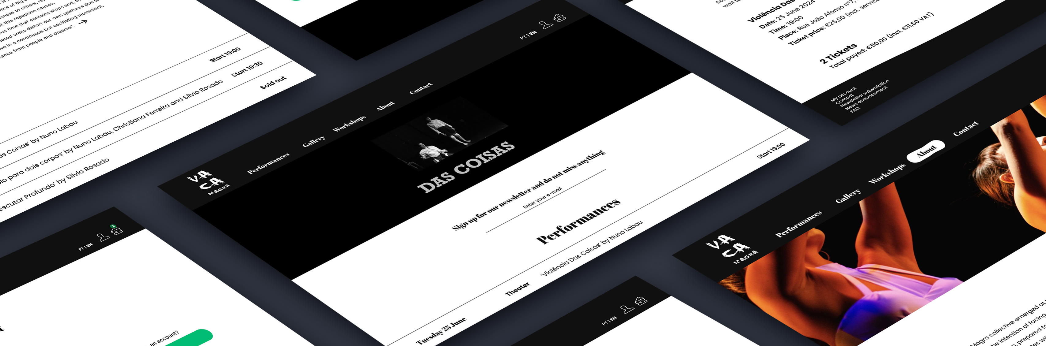
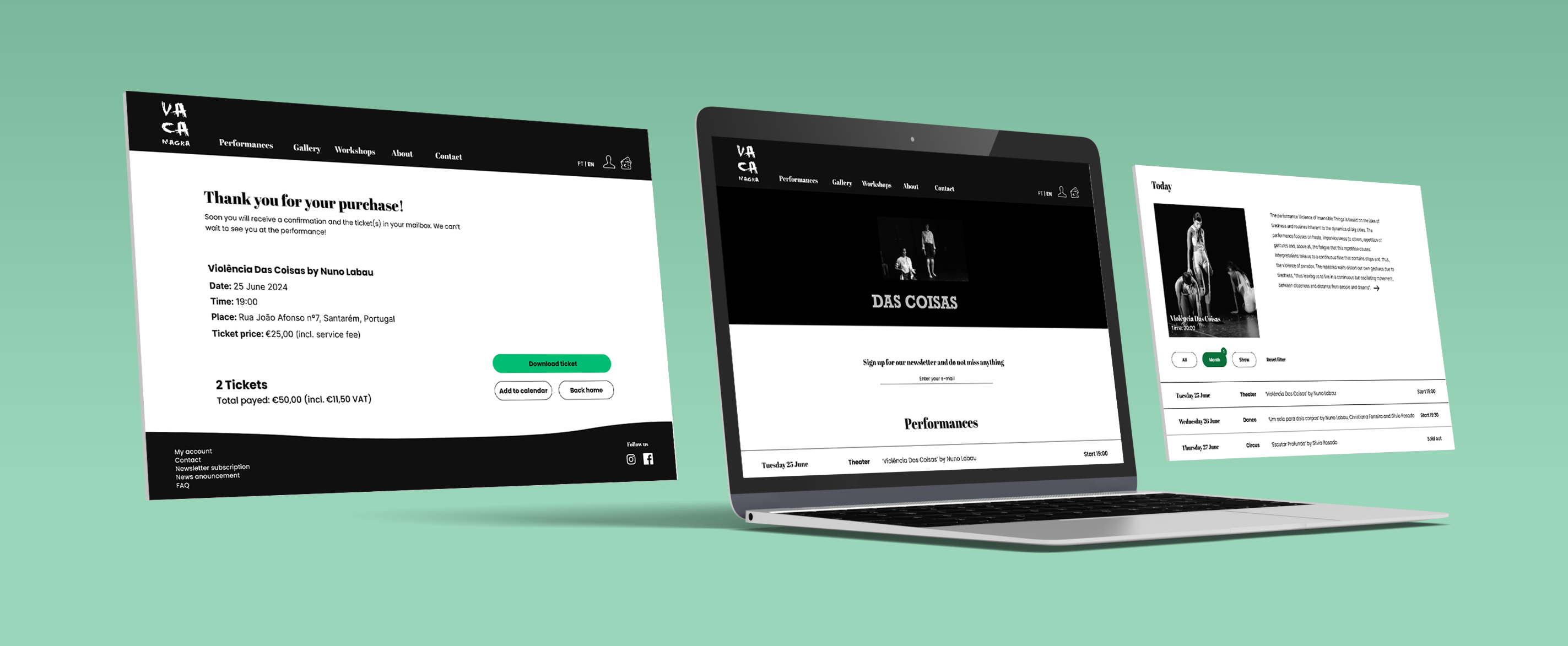
This project was about creating a responsive website for live performance association: Vaca Magra in order to inform customers and make it easier to buy tickets online. This website is mainly created for desktop, but as it is responsive it will also usable for tablet and mobile phone
Scope
UI/UX, stakeholder interview, information architecture, responsive design, wireframing, rapid prototyping, user testing and strategy.
// Research current website
This project started with research of the current website (social media) of our stakeholder: Vaca Magra. In order to see what they currenty offering, how people get in contact, which information is already available and all the visual aspects.

// Stakeholder interview
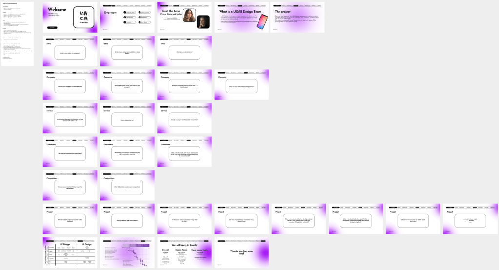
As we wanted to get more insights into the needs of our stakeholder, we planned an interview with the president of the association. We started the interview with some questions and created some slides to go through all the questions. My role during this interview was to lead the interview by asking the questions to our stakeholder and try to get really into depth.
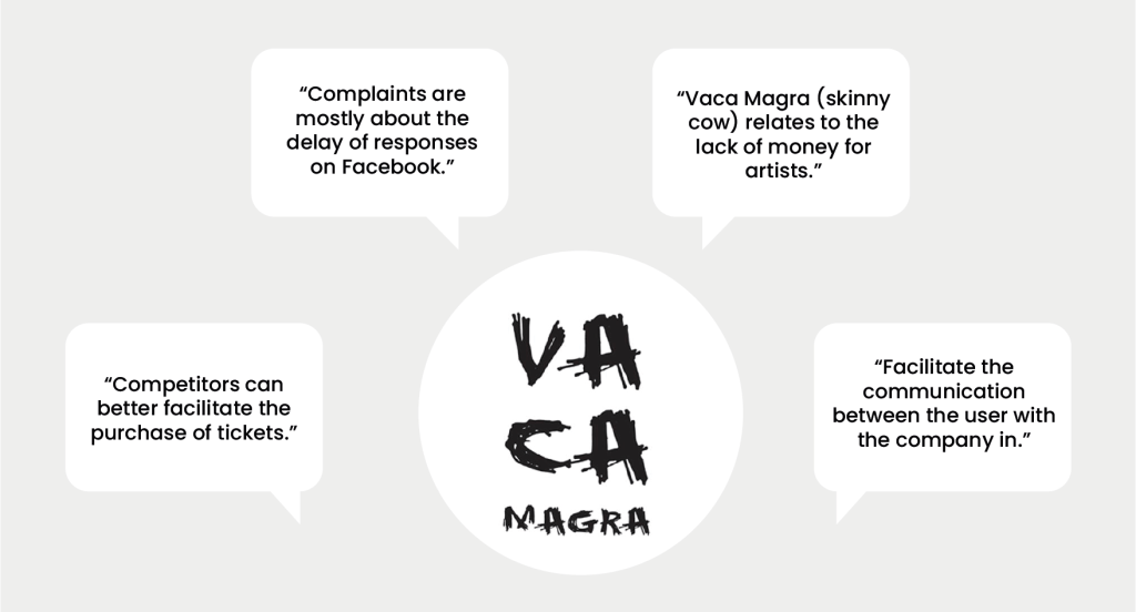
// Qualitative research
After the stakeholder interview we started with qualitative research with the help of user interviews. In total we interviewed five people that gave us both user matter and subject matter insights in order to understand the difficulties that they are facing. We equally divided the tasks as interviewer and the notetaker.

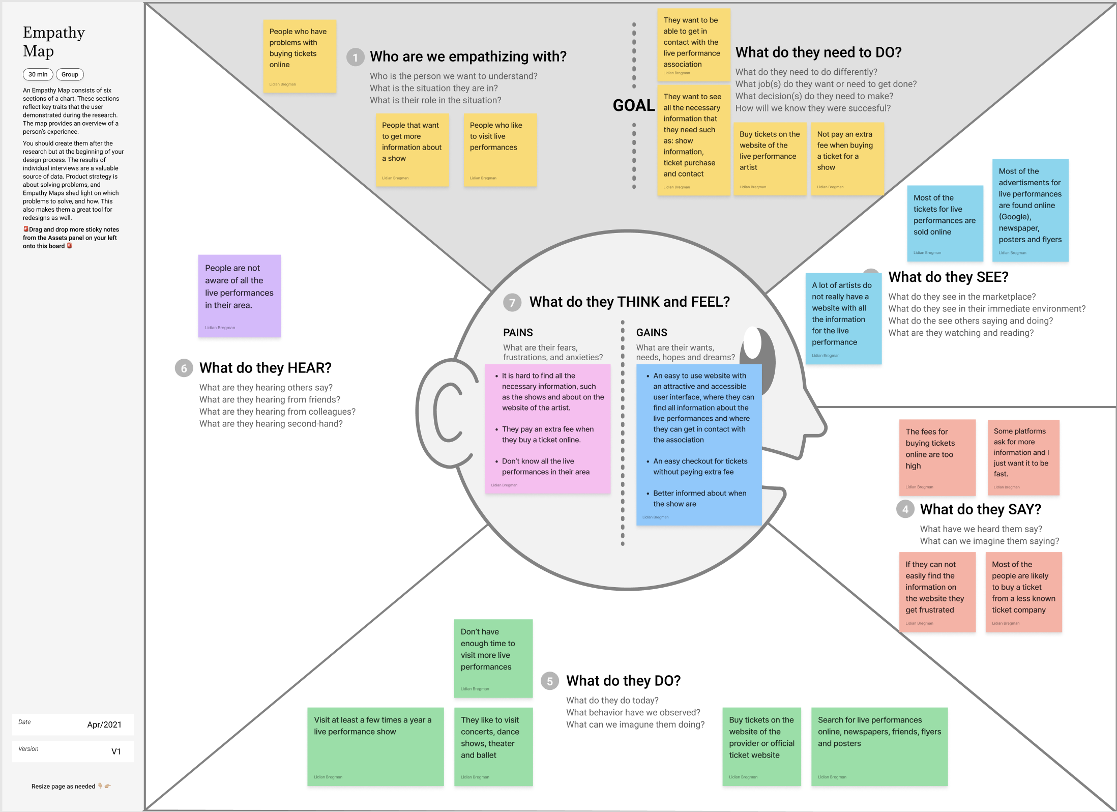
// Affinity diagram & empathy map
With all the responses of the five interviews we started to cluster all similar ideas with the help of the affinity diagram. This tool helped us to find a coherence between the answers and the topic. Now all the information were divided into groups we filled out the empathy map in order to create a shared understanding of the needs from our users.

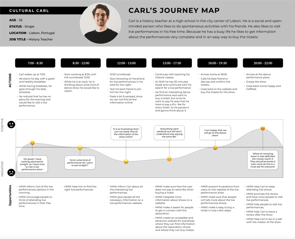
// User persona & User journey
Through the user persona research, we gathered data to build a comprehensive overview. This information helped us to define and create a clear profile of our primary user: Cultural Carl. Following by development of the persona, we mapped out a user journey for Carl. This journey tracks him for a single day and showcasing his various experiences.

// Problem statement
By mapping out the user journey we identified the pain points of our user. So the next step was to ideate the problem with the help of the problem statement. Which helped us to clearly define the problem, why it is important and who it affects.

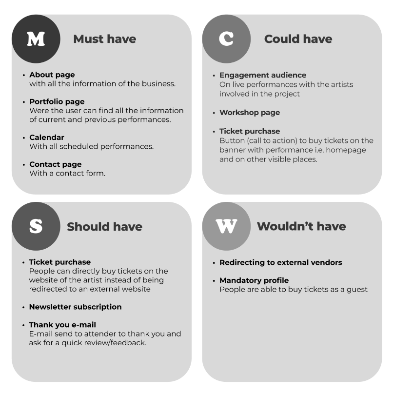
// MoSCoW method & minimum viable product
The next step was to state all features of the application with the help of the the MoSCoW-method. This tool helped us to brainstorm all the possible ideas and to prioritize all features of the website, while keeping all necessary features of our stakeholder in mind. After all the features were clear we started to formulate the minimum viable product (MVP).

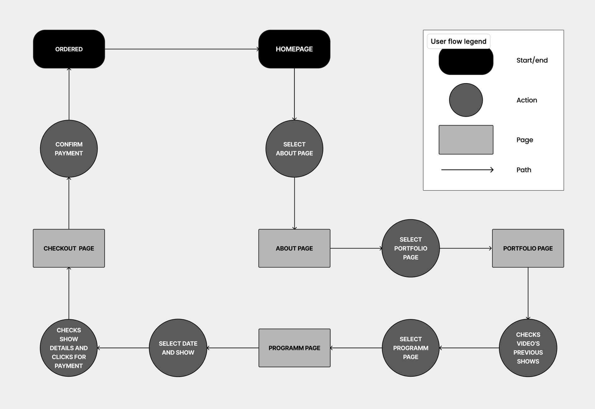
// Information Architecture
Once all the required features and the minimum viable product (MVP) were defined, I proceeded to work on the information architecture by starting with the site map. Creating the site map allowed me to organize all the crucial information that will be on the website. After completing the site map, I moved on to sketching out the user flow. This tool helped me understand how users will navigate through the application, while considering all ideas and incorporating the necessary features available throughout all phases of the application.

// Concept sketches & low fidelity wireframes
With the information architecture clarified, I proceeded to create concept sketches and then developed these sketches into low fidelity wireframes to validate my idea for the new website. After completing the low fidelity wireframes, I tested them with a total of five people.

// Low fidelity wireframes testing
Before testing
After testing

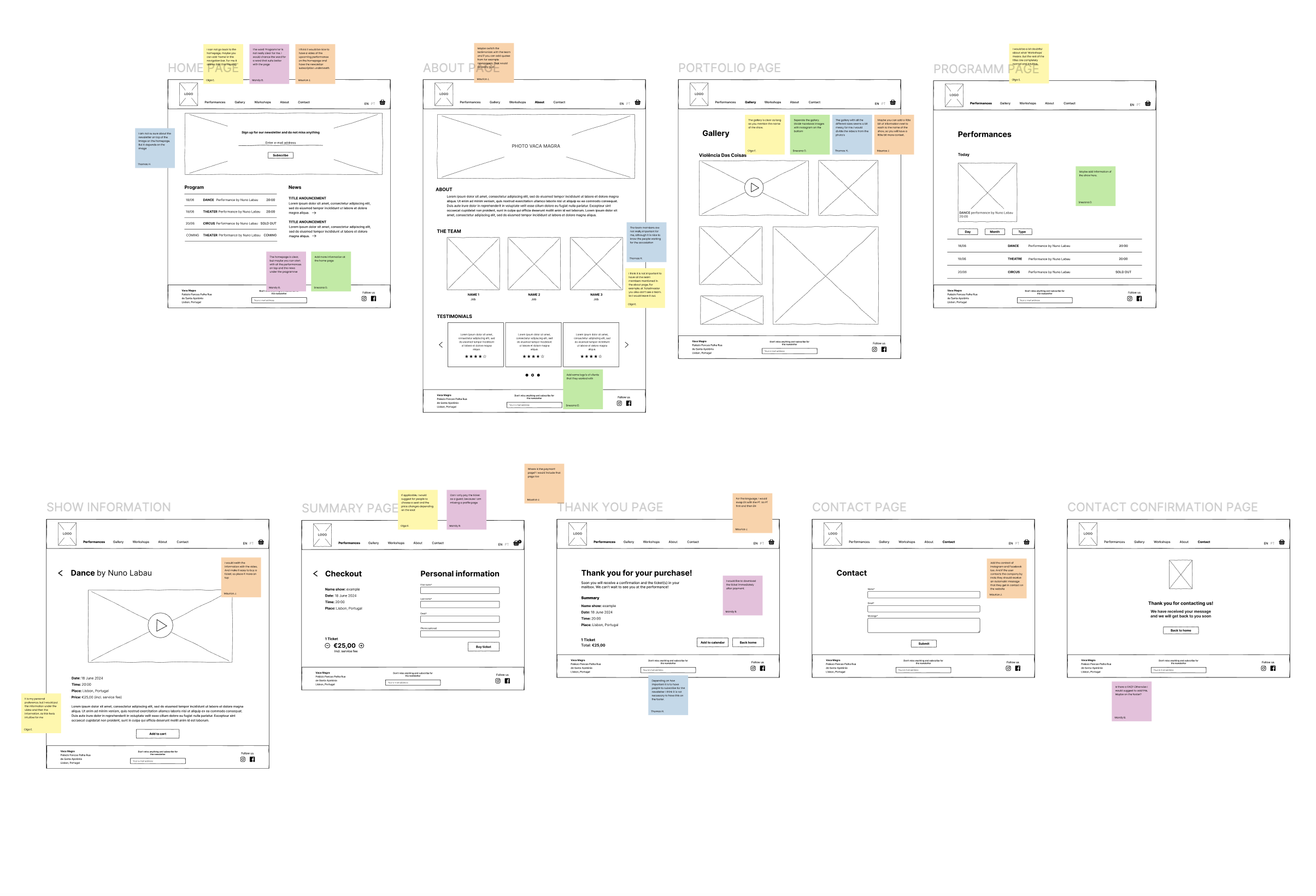
// Mid fidelity wireframes
Using the test results from the low fidelity wireframes, I incorporated all the feedback into mid fidelity wireframes. While creating the new wireframes, I also began working on the components, which allowed us to consider the different states of buttons, bars, and text. This approach ultimately helped me save time when developing the high fidelity wireframes.

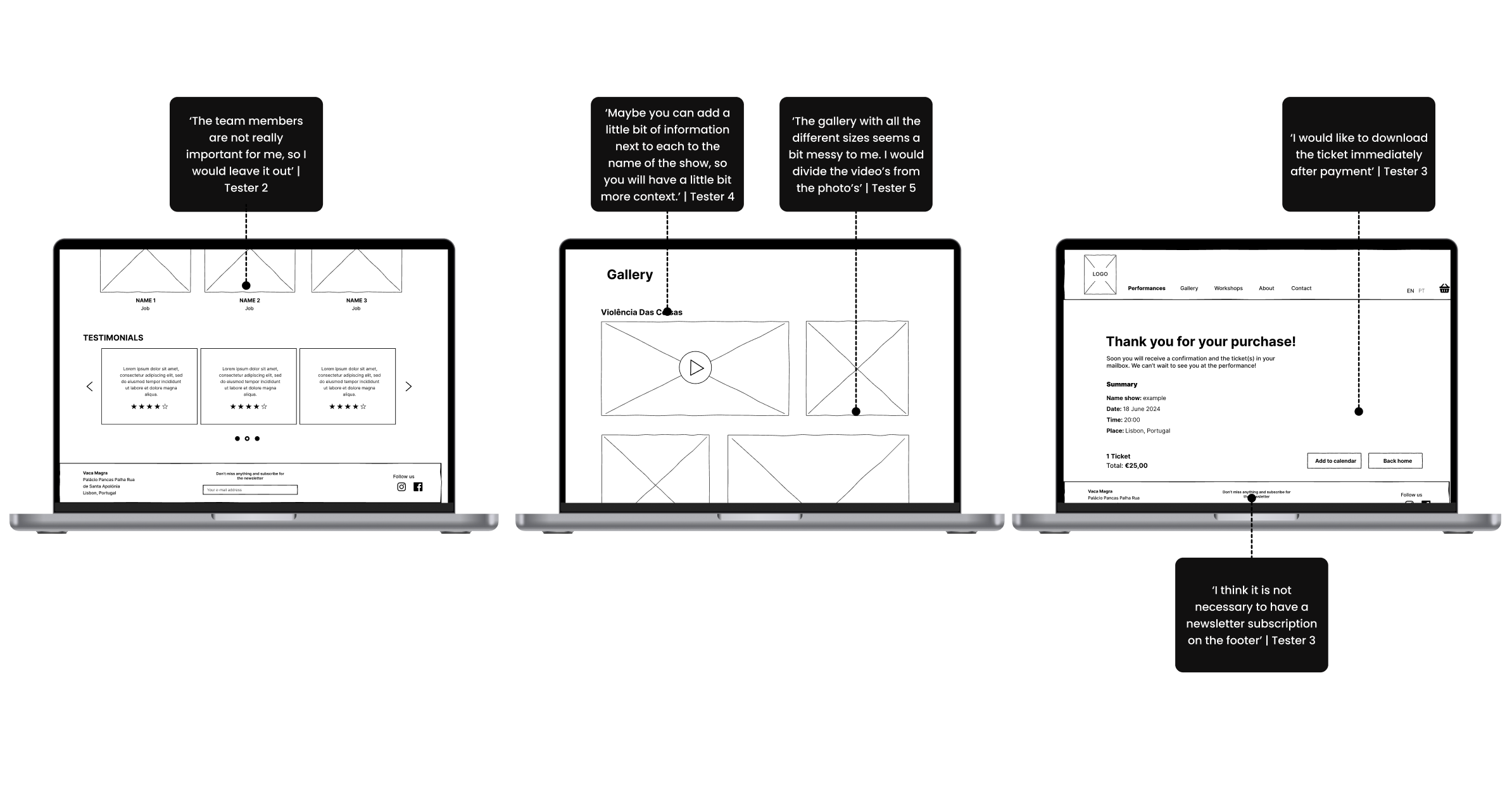
// Mid fidelity wireframes testing
Before testing
After testing

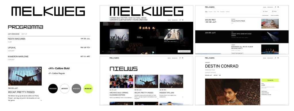
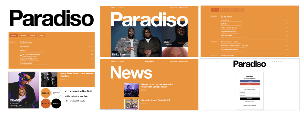
// Visual competitive analysis
The visual competitive analysis provided insights into the color palette, typography, iconography, and visual language of the three competitors. I chose to focus on three performance venues (both Dutch and Portuguese): Melkweg, Paradiso, and Performart. Primarily because they all sell live performances. I observed that the colors, typography, and logos used by these competitors were quite clean and similar, but with striking colors for the call-to-action elements.

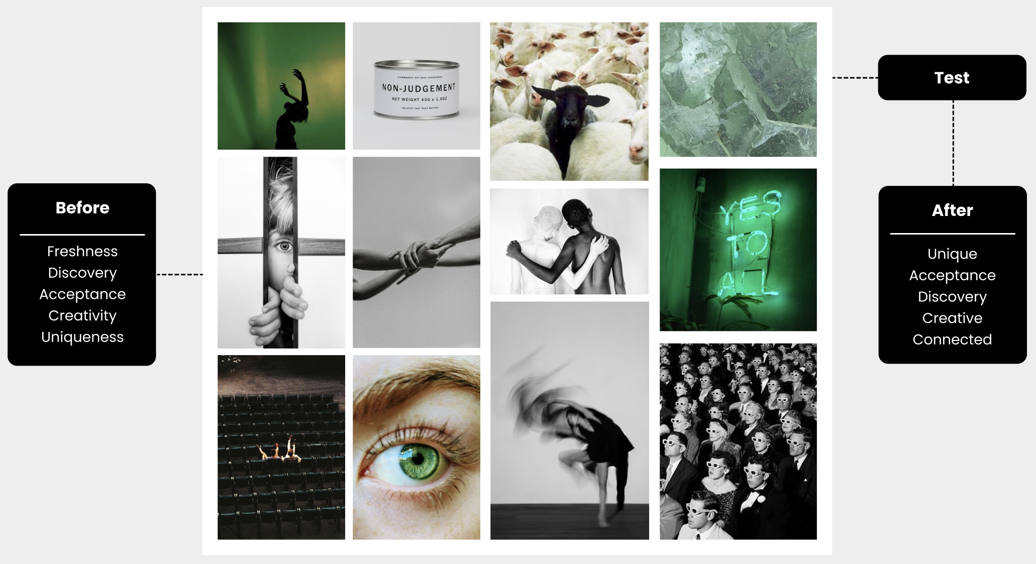
// Brand Attributes & Moodboard
The next step was to create a moodboard aligned with the chosen brand attributes: freshness, discovery, acceptance, creativity, and uniqueness. Using these brand values, I collected images that resonated with these concepts and then assembled a moodboard to convey a specific feeling at a glance. Once the moodboard was complete, I tested it with four people to ensure that the images matched the brand attributes.
// Color Palette & Typography
Now I continued with the search for suitable colors and typography. The chosen colors are based on the black, white and green colors that were picked from the moodboard and also matches with the brand attributes. Besides, one of the requirements from our stakeholder was to stick to the black and white. For the typography I chose the two fonts: Abril Fatface and Poppins. Abril Fatface for the titles and headings because of the combination of the thick and thin lines which creates a dramatic and stylish look. For the text I chose to work with Poppins, mainly since this clean font matches perfectly with the striking font of the titles and headings.
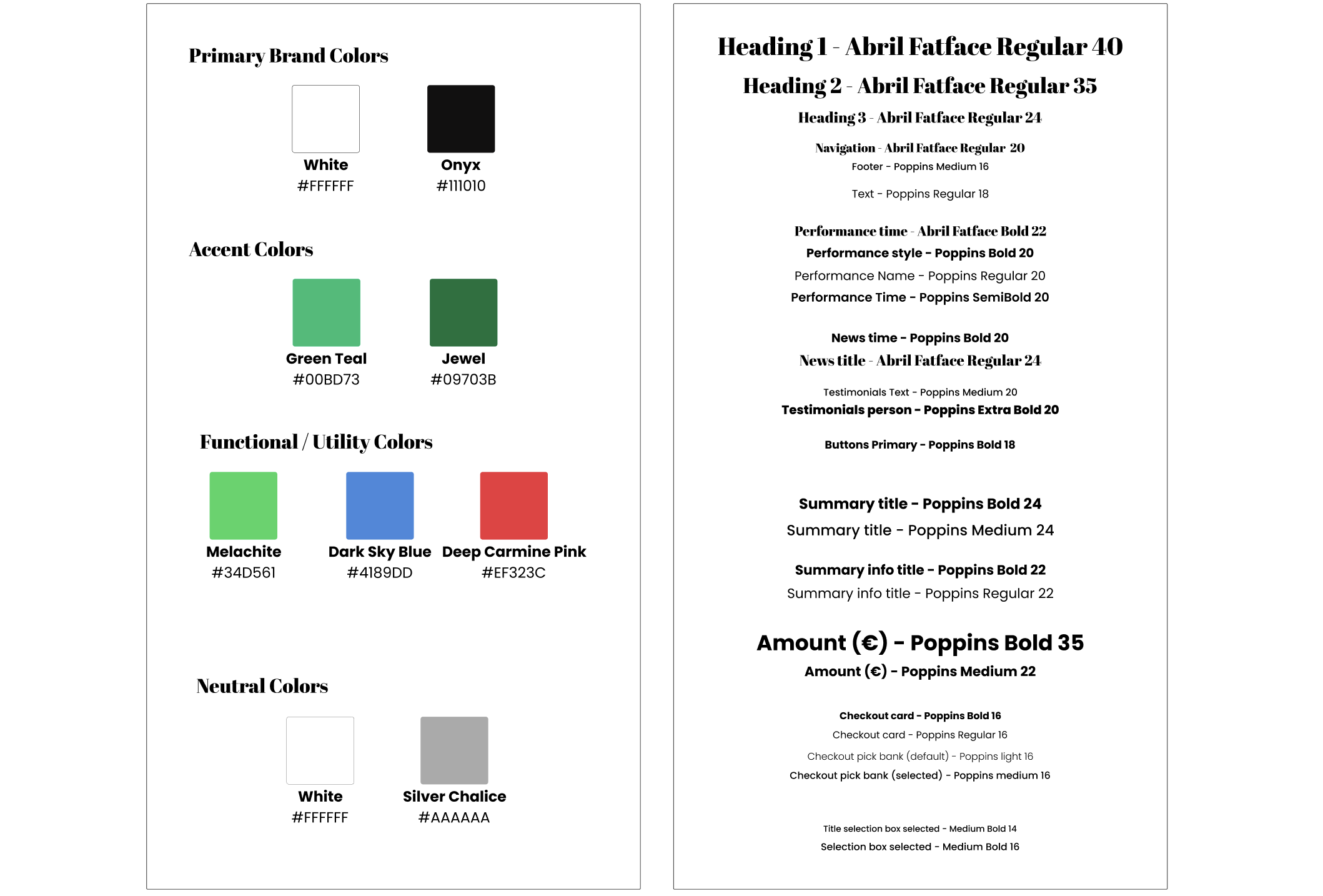
// Style tile
With the chosen colors and typology I started to fill in the visual components and put together the style tile in a clear overview. The style tile shows all the various UI elements that the user interacts with and contains elements, such as: colours, typography, bars, iconography, shapes and more.
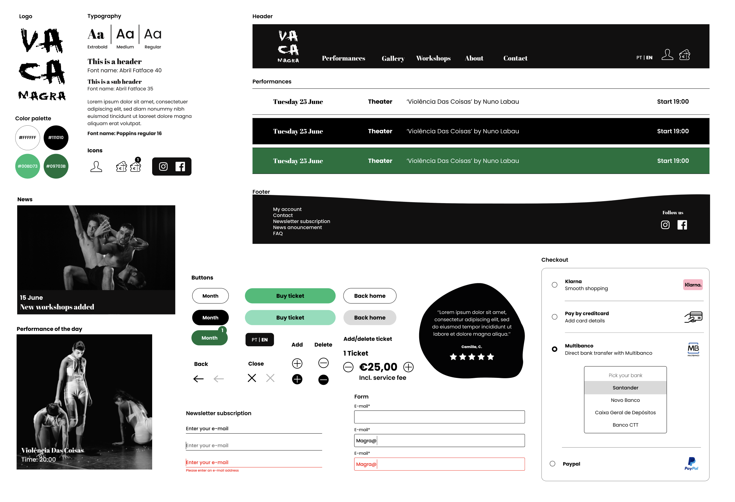
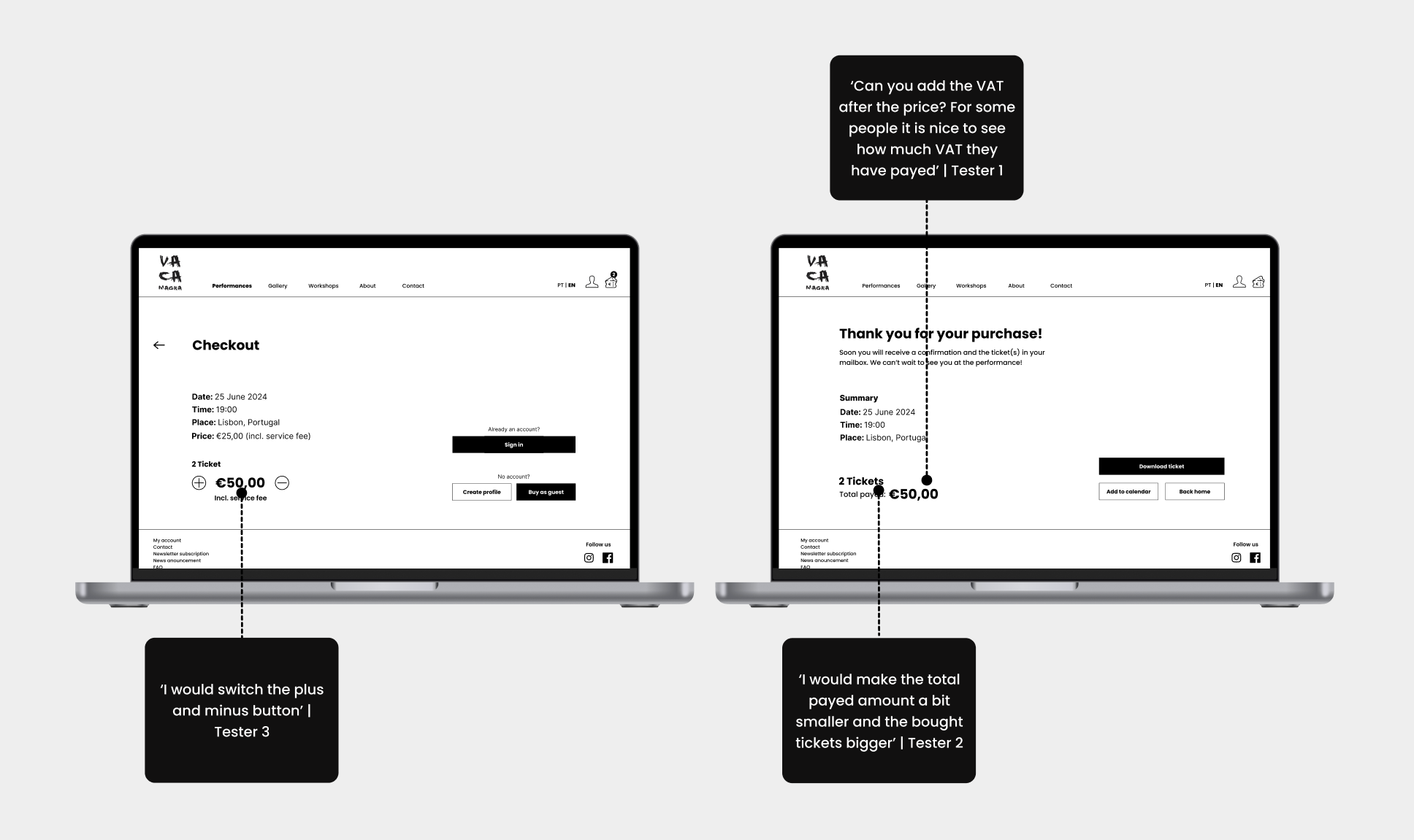
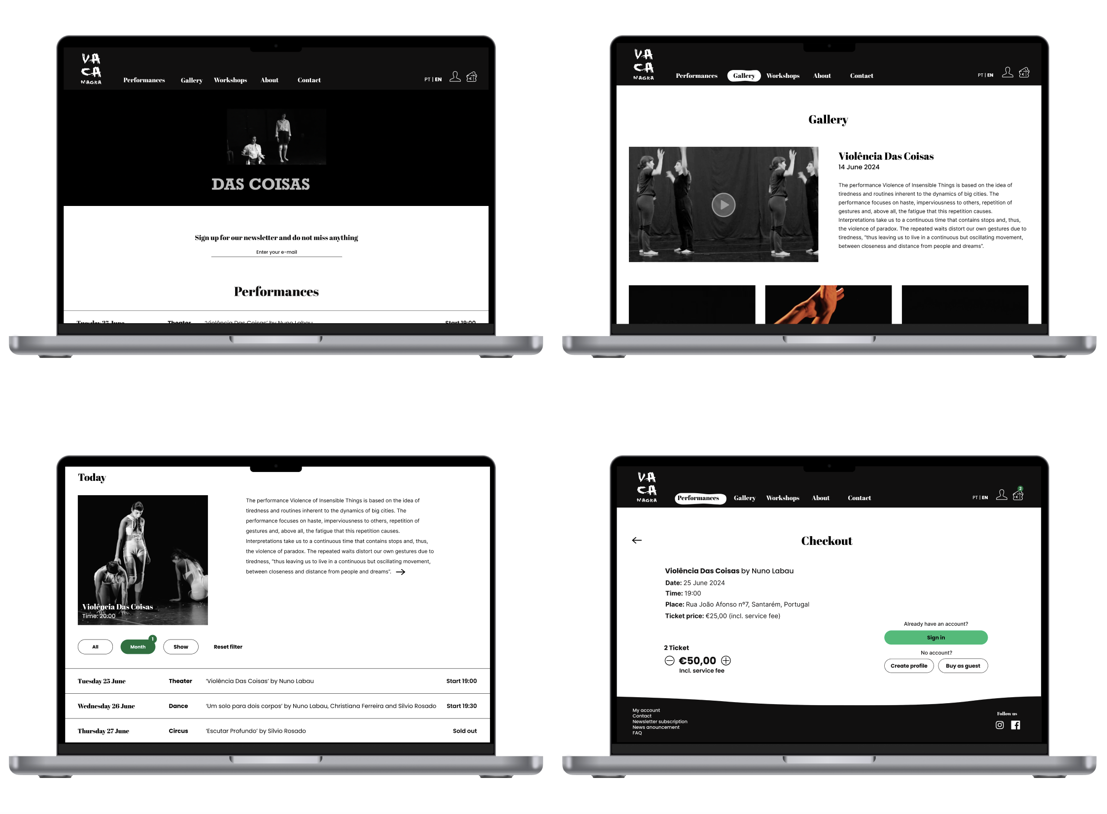
// High fidelity wireframes
After completing the style tile and considering the test results from the mid fidelity testing, I assembled all the elements into the high fidelity wireframes. One of the project’s requirements was to ensure all frames were responsive, so I made sure they were compatible with desktops, tablets, and mobile phones. Finally, I tested the new prototype through usability testing with a total of three people
// Retrospective
Stakeholder interview
This was the first project where I had the chance to work for a real client. For this reason it was super exciting and great to create a product that is really needed. I also learned a lot about collaborating with a client and really listen to the needs of the stakeholder.
Responsive design
One of the requirements of this project was to create a responsive design for desktop, tablet and mobile phone. Therefore, I had the chance to learn a lot about how to implement this in figma.
